Merry Wanderer of the Night [Search results for concrete]
The Concrete Romanticism in Lisbon

Life on the Moon
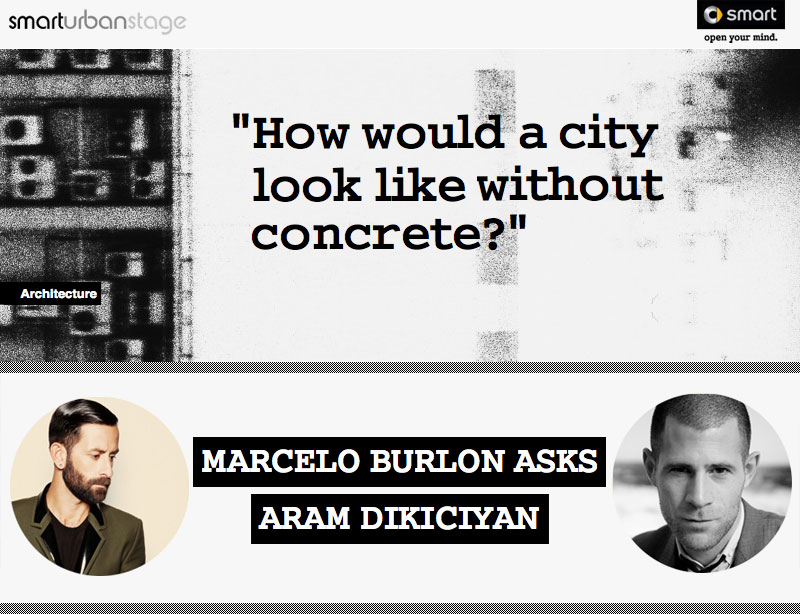
Smart’s Future of the City Continues
Hotel of new type in Amsterdam
Guest Post: The Graphic Novel
Skyscraper under an inclination
Promo-pavilion for the city of Żory
Sunday Salon: Why it is Dangerous to be a Lover of Nonfiction

Teenage Garage Sale with Variant author Robison Wells
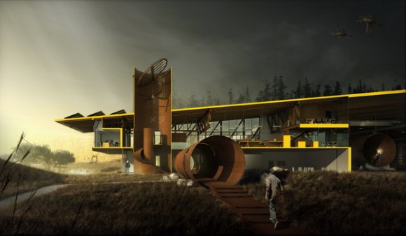
Huge Pipes, As an Architectural Element
Memory Monday — Meet Mindy!!